Call :
+16505578269Email :
support@remedo.io
You only pay what you spend on your Google Ads, no commission or hidden charges
As a dental practice, you’re probably thinking about how your website can work harder for you. Let’s get one thing clear from the start: Just like patients visit you to get their dental needs met, your website should meet the needs of every visitor—whether they’re on a phone, tablet, or desktop. Visiting your awesome website won't secure patients' appointments, but engaging visitors, effortless guidance, and appointment booking encouragement can.
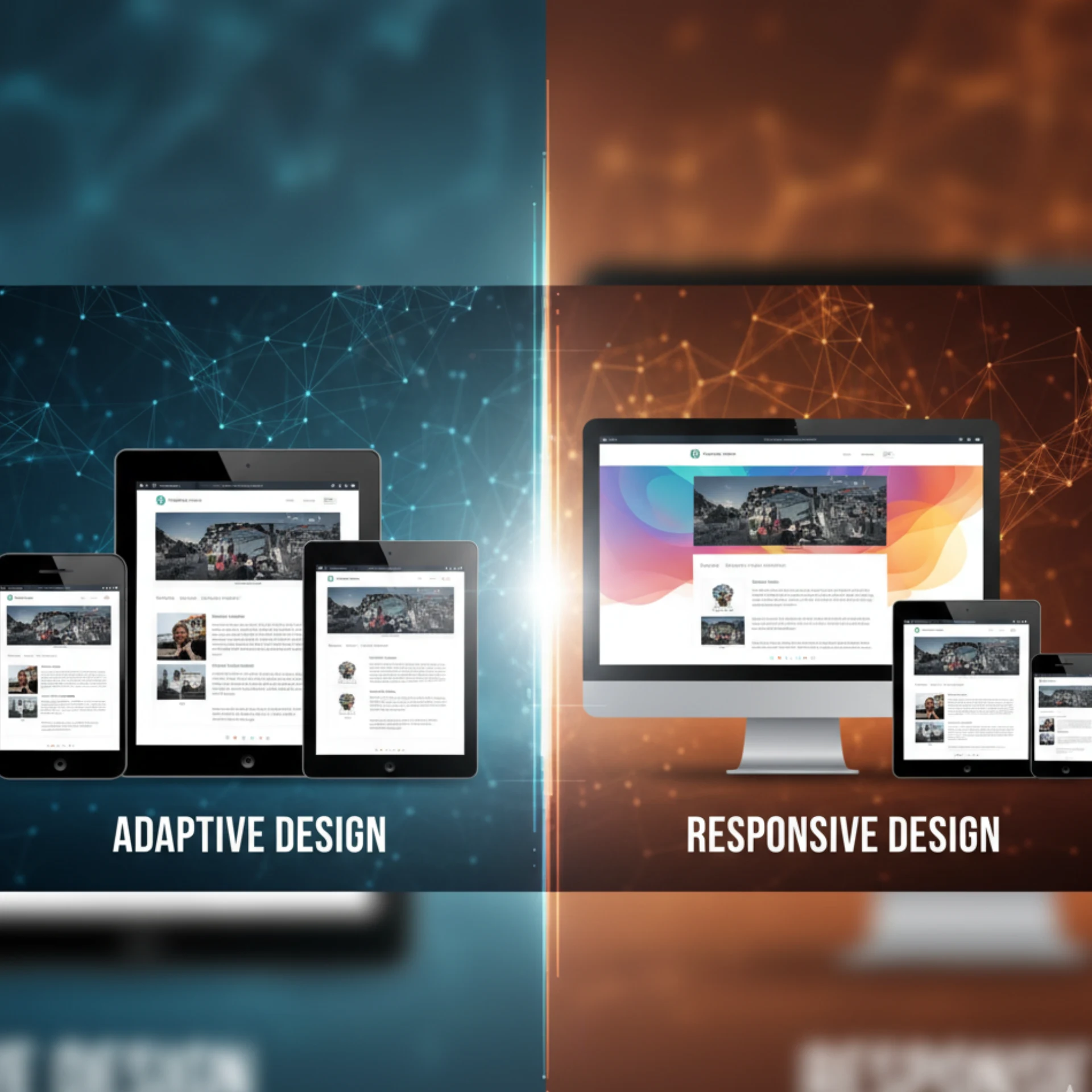
In the current mobile era world, website adaptations for multiple mobile screens are very critical. A good website needs to adjust fluidity across these screens. At the same time, it needs to have screen-based customized layouts. Choosing the right approach ensures that a potential patient has a seamless and enjoyable experience while maintaining the critical information handy. This, in turn, helps boost confidence in your practice and helps fill your chairs.
So the real question isn’t “Which design style is better?” It’s “Which design style will engage and convert more patients?”
In this guide, we’ll break down the key differences between Adaptive and Responsive Design and explore the benefits of each approach. Our goal is to help you determine which option aligns best with your practice goals, patient behavior, and budget. By the end, you’ll have a clear understanding of which design strategy can turn your dental website into a powerful tool for growth. For execution support, explore our end-to-end dental web design services and scalable dental website development.
In the current digital world, a digital stethoscope is a perfect analogy for a responsive design. Likewise, a medical chart accessible on any device, with a responsive design, also known as a fluid web layout, adapts to multiple screen layouts and sizes, maintaining consistent content. The content is adaptable to these layouts so that information like patient resources, appointment scheduling pages, health blogs, and telehealth portals is easily accessible.
These web layouts are predominantly crafted using HTML, CSS with media queries and flexible grids, devoid of any device-specific versions. Once a responsive design is created, its content dynamically adjusts until manual updates are performed. For stronger outcomes on phones and tablets, apply these practical mobile-friendly design tips.
Responsive designs load efficiently across devices since the layout is fluid and optimized for universal rendering. Comparable to a swift ambulance ride with no delays, responsive designs offer a seamless browsing experience, ensuring patients reach their destination (desired health information) without delays.
Patients are more likely to stay on a website that promptly adapts and has no lag in loading content, resulting in higher satisfaction and engagement. Implementing best practices for patient-friendly websites further improves perceived speed and usability.
Responsive designs prioritize search engine optimization, resembling a well-organized medical record with clear accessibility. With a single URL and codebase, the structure is simplified for search engines to crawl and index.
The absence of multiple versions minimizes duplication issues, making responsive designs less susceptible to SEO penalties or ranking drops, which is crucial for healthcare practices aiming to attract new patients online.
Responsive design is a low-cost solution for every enterprise, not just healthcare, that has budget constraints. Costs and development time are significantly higher to maintain layouts with multiple versions across devices, which is eliminated by responsive design. Therefore, responsive design becomes a cost-effective solution.
It especially becomes a go-to option for smaller practices or clinics, helping them to allocate resources efficiently toward patient care and operational needs.
Responsive designs resemble a one-size-fits-all medical gown, lacking device-specific tailoring. They are unable to fully optimize assets or layouts for individual devices, limiting performance features like ultra-fast loading on mobile devices used by patients on the go.
Healthcare platforms requiring extensive device-specific optimizations, such as telehealth interfaces, may find responsive designs inadequate for meeting their objectives.
Maintaining a responsive design is akin to managing a complex patient treatment plan, requiring adjustments to media queries and grids for content updates. A medical protocol, which often needs fine-tuning by technical experts on a timely basis, updating layouts follows the same. You may need technical expertise to maintain them, and at the same time, it consumes your time and money.
For larger healthcare websites with diverse device support, the fluid adjustment process can become cumbersome and inefficient, posing challenges for ongoing maintenance. Clear information architecture and website navigation tips can reduce that complexity for users.
These designs showcase health information, appointment forms, and patient resources with fluid adjustments but lack device-specific tailoring like optimized telehealth interfaces. Responsive designs find application across various healthcare domains, serving different purposes efficiently. They are commonly used for physician blogs, clinic websites, and patient education portals. Physician blogs often feature health tips and articles with automatic resizing without device-specific interactions.
Clinic websites typically provide essential information such as office hours and contact details in an adaptable manner. Patient education portals, commonly employed in awareness campaigns, offer focused entry points for health resources with clear calls-to-action that scale seamlessly. These examples illustrate the broad utility of responsive design architecture, catering to diverse needs in the healthcare sphere.
Adaptive designs are characterized by the ability to produce customized layouts in real-time. They use server-side or client-side detection, multiple layouts, and scripting languages to offer an optimized user experience. Although the layouts continue to be fluid in responsive design, adaptive designs possess customized layouts based on device properties, screen dimensions, or user agents. This accuracy supports features like device-optimized telehealth interfaces, patient-specific interactions, and optimized performance, which make adaptive designs an ideal fit for medical practices that need high customization or sophisticated patient-facing capabilities.
Adaptive designs foster device-specific optimizations, akin to a custom-fitted orthopedic brace. Adaptive design offers optimized assets, relatively reduced file size, and precise device-specific layouts. This leads to faster loading and better efficiency, which is a crucial factor for patients accessing telehealth services on mobile devices.
Enhanced performance promotes patient engagement, creating a more seamless online experience that resonates with your users who are seeking timely healthcare solutions.
Adaptive layouts provide streamlined personalization, akin to a customized patient care plan. Device detection gives developers the ability to provide individualized layouts, like streamlined mobile layouts for scheduling appointments or detailed desktop dashboards for telemedicine consultations.
This accuracy streamlines optimization efforts and allows healthcare practices to provide customized digital experiences that foster patient trust and accessibility.
Adaptive designs possess scalability akin to modular medical equipment, allowing them to expand alongside practice or platform needs. They can adapt to changes such as the addition of new device layouts or the refinement of detection mechanisms seamlessly, supporting growth in telehealth or patient portal features.
This scalability ensures the design remains agile and capable of accommodating future growth, similar to adding new tools when more functionality is required.
Adaptive designs can suffer from higher maintenance, akin to managing a fleet of medical devices. Adaptive designs have multiple layouts, which are usually device-specific, even with multiple versions. So, it takes a longer time to maintain and review them over time as compared to responsive designs. This, in turn, impacts the efficiency of healthcare practices and clinics.
Extensive updates can frustrate developers and adversely affect productivity, potentially leading to delays in updating critical patient information.
Adaptive designs, resembling intricate diagnostic systems, have multiple components and are more complex in structure. This complexity can lead to challenges in implementation, such as ensuring accurate device detection or managing multiple layouts for diverse patient devices.
Without meticulous planning, adaptive designs may encounter inconsistencies, compromising patient experience across devices. If you’re weighing trade-offs, pair planning with website conversion rate optimization tips to protect performance.
Examples of adaptive designs include many healthcare platforms that serve different needs and functionalities. Telemedicine platforms are a good example of adaptive designs, featuring device-optimized UIs, patient-specific dashboards, and streamlined consultation experiences. Patient portals also offer adaptive content presentation, appointment scheduling optimization, and device-tailored layouts, improving patient engagement. Doctor websites take advantage of adaptive design construction to serve specific health material, forms, and multimedia information for efficient performance. Furthermore, medical intranets leverage adaptive capabilities to provide personalized dashboards, scheduling software, and tailored experiences specific to certain devices employed by staff members or patients. These examples illustrate the versatility and applicability of adaptive design across different healthcare sectors, offering optimized and tailored online experiences to patients and providers worldwide.
When faced with the decision of choosing between adaptive and responsive designs, it’s crucial for healthcare practices to undertake a comprehensive evaluation of their platform’s requirements and goals. Understanding the distinct advantages and limitations of each design type is essential for making an informed decision. Start by assessing the nature of your patient audience and the level of optimization you aim to provide across devices. Reviewing common pitfalls in healthcare website design mistakes can also guide scope and priorities.
If your practice necessitates device-specific performance, tailored patient interfaces, or precise customizations, such as optimized telehealth portals or mobile-friendly appointment systems, an adaptive design might be the optimal choice. On the other hand, if your platform prioritizes universal compatibility, SEO benefits, and cost-effectiveness, such as for general clinic websites or patient education blogs, a responsive design could suffice, offering advantages in terms of flexibility and maintenance. To strengthen mobile UX regardless of approach, apply best practices for patient-friendly websites.
Think about scalability, upkeep needs, and budget limitations when selecting the design type to guarantee that your preferred design type integrates perfectly with your practice's demands and patient care goals. By following these essential steps and conducting a thorough evaluation, you can confidently select the most suitable design type to propel your healthcare practice’s digital success. If building trust is central to your goals, see how design choices directly influence credibility in build patient trust through medical web design.
Like we have already mentioned, your goals ultimately define what works well for you:
- If you precisely want control over the website's look across devices, bearing high costs and maintenance, adaptive design is a good fit for you.
- At the same time, if you prefer a scalable, cost-effective, and future-proof solution that works across devices, then responsive design is surely a win for you.
Get in touch with our healthcare marketing expert


