Call :
+16505578269Email :
support@remedo.io
You only pay what you spend on your Google Ads, no commission or hidden charges
In 2025, you probably understand how important a high-performing website is for your dental practice’s success and growth. It’s often more than your practice—it’s the first impression your patient is going to have. So always make it impressive. With features including fast loading speed and easy navigation options, it should be working flawlessly on mobile.
Various proven studies revealed that over 60% of web traffic now comes from smartphones. In that case, not having a mobile-responsive website design can cost you a loss of leads and SEO rankings.
Think about it—potential patients are browsing your services, reading reviews, and making decisions while following their other tasks of routine days. If your site isn’t fast, easy to navigate, and mobile-friendly, they’ll quickly move on to a competitor. This will lead to a higher bounce rate and a loss of potential patients.
That’s why optimizing for mobile isn’t just a tech upgrade—it’s a critical part of your patient experience. In this scenario, it is essential to find a dental web development agency that helps you create a mobile-friendly website for your practice.
Remedo is a full-service dental marketing agency that helps dentists create websites that captivate audiences, drive engagement, and achieve tangible business outcomes. In this article, we’ll share essential tips to help you build a mobile-first dental website that earns trust, boosts bookings, and supports long-term practice growth.
Why it’s no longer optional—but essential.
Whether you're a general dentist, orthodontist, or cosmetic specialist, your patients aren’t waiting to get home to look you up. They’re researching practices on their phones, comparing reviews, and booking appointments—all on the go. That’s where mobile-responsive design comes in.
Here are five powerful reasons your dental website must be mobile responsive:
1) Improved Patient Experience: A responsive website adjusts perfectly to any screen—smartphones, tablets, or desktops. This means your patients won’t have to pinch, zoom, or scroll sideways just to read about your services. They get a seamless, frustration-free experience. All this builds trust and makes them more likely to contact your practice.
2) Greater Accessibility for All Patients: In today’s world, more than 60–70% of visitors to dental websites come from mobile devices. If your website doesn’t load well on mobile, you’re missing out on a huge portion of potential patients. Particularly, younger audiences and time-pressed parents seeking immediate information benefit greatly from responsive design. Responsive design makes your site accessible to everyone, no matter where or how they browse.
3) Boosted SEO Performance: Google favors mobile-friendly websites. A responsive design ensures your practice shows up higher in local search results when someone searches “dentist near me” or “emergency dental care.” Better visibility = more clicks = more new patients walking through your doors. Learn more from our dental SEO services.
4) Lower Bounce Rate, Higher Conversions: If a patient lands on your website and finds it clunky or hard to use on mobile, they’ll leave within seconds. That’s your bounce rate—and a high one kills conversions. A responsive dental site keeps visitors engaged, guides them through services smoothly, and encourages appointment bookings right from their phone. Learn from our website conversion rate optimization tips for dentists.
5) Cost-Efficient Development: With responsive design, you don’t need two separate sites—one for mobile and one for desktop. You manage one site that automatically adapts to every screen. That means lower development costs, easier updates, and more time to focus on patient care.
What are the key features of a mobile-responsive website? When you open a site on your phone and the layout is messy or hard to use, you leave—so do your patients. A mobile-responsive dental website adjusts to any screen, loads fast, and makes key info easy to find and tap. Here are 10 best practices to help you build one that converts.

Unlike desktop users, mobile visitors don’t click—they tap and scroll while browsing your dental website. That’s why every interactive element—like the “Book Appointment” button, menu, or contact link—should be easy to reach and tap with just a thumb.
When designing your dental website, make sure buttons, CTAs, and links are large enough to tap without errors. They should be spaced out properly, especially on important pages like services and contact forms. If buttons are too small, links are too close together, or drop-downs require zooming in, users may tap the wrong thing—or worse, leave the site.
If your design ignores how people use their phones, it can cause frustration, misclicks, and a higher bounce rate. And that’s not just a user issue—Google tracks these behaviors. When people leave too quickly, it can hurt your site’s SEO and lower your search rankings.
A mobile-friendly layout that supports natural scrolling and thumb navigation does more than look good. It establishes a smoother user experience. This can convert a casual browser into a booked patient.
While planning a website, always put yourself in the shoes of the patient. As a dental practice owner, you might be aware that your patients are mostly busy and, in most cases, browse through their phones while doing something else. They want quick solutions—where your clinic is located, what services you offer, and how to book an appointment.
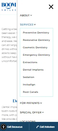
That’s why your navigation should be simple, easy to find, and straightforward—not confusing at all. To make this work well on mobile, you can use a streamlined, collapsible menu—usually shown as a hamburger icon. You can also support this with local SEO for dentists to improve your visibility.
Include only the most important pages, clearly labeled—like “Book Appointment,” “Our Services,” “About Us,” and “Contact.” Keep it clean and avoid filling the menu with too many subpages or confusing terms. All these features will more likely help your patients actually find what they are looking for on your website.
Also, consider using a sticky header—a navigation bar that stays at the top of the screen as the user scrolls. This small feature can make a big difference. These sticky headers can boost appointment page clicks by up to 18%.
A simplified, always-accessible menu helps users stay oriented and encourages them to take action, which ultimately leads to better engagement and more conversions for your practice.
Prioritize speed – aim for under 3 seconds. While patients don’t wait long for a page to load, your website has only a few seconds to make a good impression. In fact, if your dental website takes more than three seconds to load, nearly half your visitors will leave—and that’s a missed opportunity.
Speed matters a lot, especially when patients browsing your website on their mobile. A slow-loading website frustrates them and increases the bounce rate. To keep them engaged, make sure your site is optimized for speed. Compress large images, reduce unnecessary scripts, and use mobile-optimized hosting that delivers quick loading on any device.
Keep in mind that a fast-loading website isn’t just a mobile-responsive feature—it also improves your SEO rankings. Google considers page speed a direct ranking factor, especially for mobile searches. All this influences a patient’s decision to book an appointment by highlighting the quality of your dental services.

Make it easy for patients to act. When someone lands on your dental website, especially on mobile, the goal is to reduce the number of steps it takes to contact you or schedule an appointment.
Your phone number should always be clickalble, allowing patients to call with a single touch. The same goes for your “Book Now” button. Avoid complex forms that ask for too many details—because most users won’t fill them out on a small screen.
Place both call and appointment buttons in the top-right corner of your mobile site and repeat them at the bottom of every page. This gives your visitors multiple chances to take action—whether they’ve just landed on your homepage or finished reading about your services.
These features are more than convenient—they directly increase conversions. When your site is built to match patient behavior, you make it easier for them to trust your practice and take the next step.

For a dental website, being mobile-friendly isn’t enough. It should be fully responsive. That means your dental website should automatically adjust its layout based on the screen size—whether it's an iPhone 15, a Samsung tablet, or any other device.
A responsive design ensures everything looks clean and functions smoothly, with no awkward zooming, cut-off images, or broken layouts. Everything—from text to buttons to images—should shift naturally to fit the screen. This gives your visitors a seamless browsing experience, which builds trust and keeps them on your site longer. Learn how to build patient trust through medical web design.
Your website visuals play a big role in building trust—especially in dentistry, where patients want to see actual results. By showcasing before-and-after photos, team portraits, and clinic shots, you help humanize your brand and show credibility.
But large, unoptimized images can slow down your website. And on mobile, slow-loading pages lead to high bounce rates. Even worse, if your design isn’t responsive, images can appear over-zoomed or poorly cropped—giving a bad first impression.
To make your dental website mobile-friendly, use WebP or next-gen formats. They keep image quality high while reducing file size for faster loading. Also, you can display visuals in the form of carousels or swipeable sliders. This makes it easy for patients to scroll through smile transformations or tour your office—right from their phone.
That means more engagement, more interest, and higher chances of conversion. A dental site with fast, professional-looking images not only feels premium—it helps turn patient interest into action.
We’ve learned that visuals matter, but readability is just as important—especially on mobile. Your patients shouldn’t struggle to read your services or bios. No one wants to zoom in just to read about your services or contact info. This is where dental content writing services can help simplify and structure your content.
According to modern accessibility guidelines, text should be easy to read without strain. That means using at least 16px for body text and avoiding light gray or low-contrast fonts.
Patients visit your website to get key information—fast. If they have to squint or zoom in, they’re more likely to leave. Website users expect to see features like:
- Clear, readable fonts
- High contrast between text and background
- Paragraphs that are easy to scan
- Content that adjusts well to any screen size
Readable text creates a smoother experience and helps your message come through—without making users work for it.
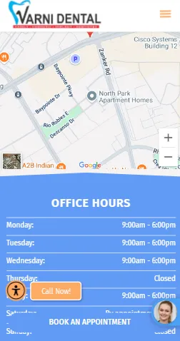
When mobile users land on your dental website, they are most likely to check for the clinic’s opening hours and where it is located. That’s why your NAP info (Name, Address, Phone) should be placed front and center, not buried in footers or long submenus. Include your Google Map location, business hours, and direct call button right on the homepage and prominently on your contact page. Make sure it’s all mobile-optimized—so one tap can launch directions or dial your number instantly. This is also essential for maintaining your Google Business Profile accuracy and visibility.
This improves both user experience and local SEO. When search engines find consistent and visible NAP information on your website, they’re more likely to prioritize your site in nearby searches over those that lack it.
This makes it easier for patients to find and contact you—especially when they are browsing on their mobile. Thus, accurate, accessible location details paired with mobile optimization build trust, drive local visibility, and increase conversions.
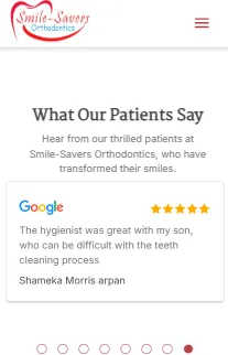
Patients trust patients. Continuing on that thought, building trust is paramount in attracting potential clients. One of the most effective ways to do this is by embedding patient reviews and testimonials directly into your dental website—especially on mobile. These reviews serve as social proof, giving new visitors reassurance through real experiences shared by others.
Make sure your Google and Yelp reviews are mobile-optimized: scrollable, easy to read, and clearly display your star ratings. Avoid cluttered layouts or static screenshots. Use live widgets or plugins that pull reviews in real-time to keep content fresh and credible.
Displaying authentic feedback—right where mobile users are looking—reinforces your credibility. It influences patient decisions by showing the quality of care you provide and can even ease dental anxiety for someone browsing while anxious about their first visit. A responsive, visible review section doesn’t just add trust—it helps turn browsers into booked patients.
Before launching or updating your dental website, don’t just rely on how it looks in a design preview—test it like a real patient would. Start by opening your site on actual devices: an iPhone, a Samsung Galaxy, and a tablet. Use Google’s Mobile-Friendly Test to run a quick technical check. Then go beyond that—try to book an appointment, find your clinic’s location, and read a service page. If anything feels slow, confusing, or hard to tap, chances are your patients will feel the same.
You can also ask 2–3 team members to do the same on their own phones and share their honest feedback. Often, they’ll catch things you might miss.
The best dental websites are built around real-life user behavior—not just what looks good in a mock-up. If your mobile site isn’t smooth, fast, and patient-friendly, you risk losing potential bookings before a patient ever contacts your practice. Explore healthcare digital marketing services to ensure your overall strategy supports long-term digital success.
Get in touch with our healthcare marketing expert


