Call :
+16505578269Email :
support@remedo.io
You only pay what you spend on your Google Ads, no commission or hidden charges
The healthcare industry is constantly evolving, and patient needs and expectations are undergoing significant changes. Previously, people trusted word of mouth when seeking medical care; today, that trust has shifted to digital. Patients now judge your clinic by what they see online, often in seconds.
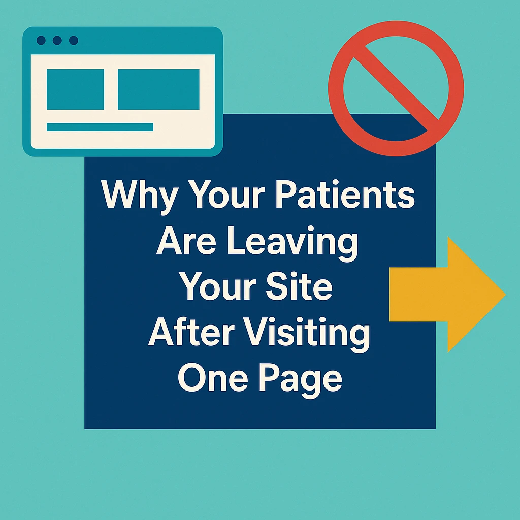
So, if you’re seeing traffic roll in—patients are finding your website—but instead of exploring your services or booking a consultation, they leave after just one page. Sounds frustrating, right? Especially when your dental expertise is solid and your marketing is working to get you noticed.
Scratching your head with no clue? Asking your receptionist what went wrong won’t get you far.
Yes, there can be various reasons why your dental website visitors aren’t turning into patients. Many practices overlook a few key issues on their website—small details that create confusion, doubt, or friction. These unnoticed gaps can be the reason patients click away before taking action.
So why exactly are visitors leaving so quickly? Let’s look at what might be driving them off your site—and how to fix it.
We’re pretty sure you’ve worked hard to bring potential patients to your site—but when leads don’t follow, it can make you question everything. Is it the layout? The content? Or something deeper?
The truth is, even small mistakes can quietly deter your website visitors. Let’s uncover a few proven reasons why patients leave your site immediately right after landing:
In 2025 and beyond, most patients search for dental care on their phones—especially when dealing with sudden tooth pain or trying to figure out what a cavity looks like. If your site isn’t responsive, they’ll bounce before they even learn about your services.
Your dental website should do one of two things on mobile: help patients easily book an appointment or guide them to the next relevant service (like “Emergency Dentistry” or “Cavity Treatment”). If it’s doing anything else—such as having confusing layouts, slow loading, or a clunky design—it’s failing the basics.
Ask yourself these questions to spot the issue:
- Is your site loading quickly on mobile? A 5-second delay is long enough for someone in pain to tap “back” and choose another clinic.
- Are key buttons, such as “Book Now” and “Call Us,” easy to find and tap? If not, you’re losing potential patients at the most crucial step.
- Is your text legible and layout clean? On small screens, cluttered content or tiny fonts can instantly ruin the user experience.
- Is navigation mobile-friendly and intuitive? Menus shouldn’t be hard to open or close on a phone.
If browsing your site on mobile feels like a chore, patients won’t push through—they’ll leave and book elsewhere. If you're unsure where to start, review these mobile-friendly design tips for your dental practice to guide your updates.
Tips to Fix It:
- Use a responsive web design that automatically adjusts layout, buttons, and content for every screen size.
- Compress images and reduce scripts to improve mobile load speed.
- Place a clear, sticky CTA button ("Book Now") that’s always visible as users scroll.
- Simplify your layout with larger fonts, whitespace, and easy-to-tap navigation for mobile users.
- Regularly test your website on multiple mobile devices to catch usability issues early.
Do you think patients who won’t wait in long appointment queues are going to wait more than 5 seconds for your website to load? Most of them—especially when they’re in pain or searching in a hurry—absolutely won’t. If your dental site is slow, you’re losing potential bookings before they even see what you offer.
Slow-loading pages are among the biggest conversion killers in the game—and also the most unnecessary. In 2025, speed is trust. Don’t let slow load times cost you your next patient. In most cases, fixing the issue is quick and straightforward.
Ask yourself:
- Are large, uncompressed images slowing things down?
- Do unnecessary redirects delay the first page from showing up?
- Is your hosting plan built to handle traffic from mobile users?
Page speed doesn’t just affect conversions—it hurts your Google rankings too. This is low-hanging fruit. If your site is lagging, get your developer involved today. Learn how to increase site speed optimization for dental practices and reduce bounce rates caused by slow load times.
Tip to Fix It:
- Compress heavy images and convert them to faster-loading formats, such as WebP.
- Remove unnecessary redirects and clean up bloated code.
- Switch to dedicated or cloud hosting for more speed and stability.
- Use tools like Google PageSpeed Insights to monitor and track improvements regularly.
Your patient may leave your site before booking an appointment or making an inquiry if they’re unable to find exactly what they’re looking for. If your website makes them click around too much—or worse, confuses them with messy menus—they’ll give up and move on.
This usually happens when your navigation is disorganized, inconsistent, or overloaded with too many options. Pages aren’t grouped logically, services are hard to find, and simple actions like “Book Now” or “Contact” are buried. For a patient in a rush—or dealing with pain—this is an instant red flag.
Tips to Fix It:
- Use a clean, top-level menu with 5–7 key items only.
- Organize services under clear categories, such as “General Dentistry,” “Cosmetic,” and “Surgical,” etc.
- Add a prominent “Book Appointment” button in the header.
- Test your navigation flow—especially on mobile—every few months.
Keep in mind good navigation is all about showing patients you value their time. If they can’t find what they need, they’ll assume your service is just as disorganized. Follow these dental website navigation tips to streamline user flow and help patients find what they need faster.
Right when a patient lands on your website to book an appointment and finds a long, complicated, or confusing inquiry form, they either call in frustration or bounce off completely. Sometimes, they don’t want to share too many personal details just to schedule a basic check-up. And if the process feels like a chore, they’ll choose another clinic.
This is where many dental websites lose out. A booking form with too many fields, unclear steps, or missing confirmations creates friction. Patients expect simplicity, especially if they’re in a hurry or feeling anxious about treatment. Also, smooth booking is directly proportional to higher conversions. Don’t let a clunky form turn away patients ready to say yes.
Ask yourself:
- Does your booking form take less than 60 seconds to complete?
- Are you only asking for essential information (name, contact, reason for visit)?
- Is it clear what happens after they submit—will someone call, or is it confirmed?
- If your booking process feels more like filling out a tax form, your patients won’t push through.
Tip to Fix It:
- Shorten your forms to just the basics—name, phone, email, and reason for visit.
- Add auto-confirmation messages or follow-up instructions to build trust.
- Ensure your forms function smoothly on mobile devices without zooming or glitches.
- Offer a clear call-back option for patients who prefer not to fill out forms.
Research shows that online users are becoming increasingly cautious about where they place their trust—especially in healthcare. For dental practices, this means that your website design plays a significant role in establishing credibility. If your site looks outdated, poorly designed, or untouched since 2015, your visitors are more likely to assume your care is equally behind the times.
A modern, clean, and trust-building design can immediately set you apart and help patients feel confident in your practice before they book an appointment. Think about how you present your practice digitally. Is it making people feel safe, assured, and ready to book—or is it creating doubt?
Here are a few trust-building factors you should include while creating or maintaining your website:
a) Patient review highlights – Add star ratings and quick testimonial snippets on treatment pages or near the “Book Now” button.
b) Detailed testimonials with real names or photos – Showcase them on the homepage, service pages, or just below your main banner.
c) Trust and safety badges – Include professional affiliations (like ADA), HIPAA-compliant tags, or certifications received by your clinic.
d) Your practice history – A simple “Serving patients since 2008” in the footer or header builds instant authority.
e) Total number of happy patients treated – This creates social proof and communicates reliability at a glance.
Tip to Fix It:
- Refresh your website design every 3–4 years to stay current with modern UX trends. Pediatric clinics especially should review the features of pediatric dental websites to understand how clean design and usability impact perception.
- Use professional photos and visuals of your team and clinic to build a real connection and upload them on the website.
- Add up-to-date trust indicators and remove any outdated graphics, fonts, or logos.
- Run a quick visual comparison with top practices in your area—if your site feels behind, so will your brand.
There’s little more frustrating for a potential patient than landing on your website and not understanding what your practice actually offers. Sometimes, they just want to know if you provide a specific treatment—like wisdom tooth extraction or Invisalign. At other times, they’re simply looking for your exact location, hours, or whether you accept their insurance. But instead of finding clarity, they’re met with pages full of fluff, jargon, or irrelevant content that doesn’t answer what they came for.
When patients feel overwhelmed, confused, or unsure if you’re the right fit, they usually leave your site after landing on the home page.
Why does it happen?
- Service pages are too broad or hold too much technical information.
- Information is buried deep or scattered across different pages.
- You’re listing every treatment possible without helping patients understand what you actually specialize in.
Here’s how to fix it:
- Be specific about your dental care offerings. For example, instead of just listing "cosmetic dentistry," explain if you offer veneers, whitening, or bonding.
- Organize your website content to align with your potential patient's intent and demand. Help them quickly find what they’re here for.
- Make essential info easy to spot. For which, you can add quick-access sections for hours, location, accepted insurance, and contact.
- Trim the fluff or complex information available on your site. Every word should guide the patient closer to booking, not overwhelm them with too many options or filler content.
In healthcare, where sensitive data and personal information are of paramount importance, patients choose only those clinics they trust. If your website doesn’t feel secure—or lacks the right trust indicators—most patients won’t stick around to fill out a form or book an appointment. Especially when they’re asked to share their contact numbers, insurance details, or medical concerns, even a slight doubt about security can cause hesitation.
Patients are savvier today—they notice whether your site is HTTPS-secured, whether your forms seem legitimate, and whether your website feels like it belongs to a credible medical practice.
Make sure your website has the following features to build trust and encourage action:
- HTTPS encryption is enabled across all pages (your URL should start with https://, not http://).
- Recognizable security icons, such as “Verified by Norton” or “SSL Secured,” are placed near forms and footers.
- Badges showing HIPAA compliance or certifications for handling patient data.
- Familiar payment options like PayPal or Google Pay, shown with logos at checkout or booking steps.
- A trust statement near your forms or footer, like “Your information is 100% safe with us” or “This form is encrypted and HIPAA-compliant.”
All these changes calm your patients. When your site feels safe, patients feel safe.
A well-designed website with relevant content and premium visuals won’t turn visitors into patients—unless your website is lacking in relevant, actionable CTAs. Strong CTAs guide your visitors. They reduce friction. They give direction at the exact moment when the patient is ready to act.
This is where most healthcare websites lose out on their potential patients. Even after gaining attention and trust, they drop the ball by hiding their call-to-action (CTA), making it hard to find or too generic to motivate action.
Think about it: a patient lands on your site looking for help, but your “Book Now” button blends into the background, or worse, it’s buried below a wall of text. Most of them won’t scroll for more and will simply leave the site. Your CTAs are the bridge between interest and action. If it’s not obvious, clickable, or compelling, you’re losing potential bookings every single day.
Make sure your CTA is conversion-ready by checking these essential elements:
- Is the CTA button in a contrasting color that instantly stands out?
- Is it placed above the fold so patients see it immediately, without scrolling?
- Is it written as an imperative command like “Book Your Consultation” or “Schedule My Visit”?
- Is the button placed near key info, like service details or pricing?
- Does the CTA span the full width on mobile, so it’s easy to tap with either thumb?
- Is it repeated smartly throughout the page—after key sections or FAQs—without being spammy?
Failing to provide immediate patient support or assistance can erode their trust and mar the experience. When someone lands on your dental website, they’re often seeking fast reassurance — not just information. Whether it’s about insurance queries, procedure doubts, or urgent availability, the absence of real-time help can feel dismissive or impersonal. A great starting point is implementing an AI chatbot for doctors that provides 24/7 patient interaction and booking assistance.
Ask yourself:
- Can patients find real-time help without calling? If you don’t offer live chat or instant messaging, you’re relying on outdated channels.
- Does your chatbot solve real problems, or does it just collect names and emails? A helpful chatbot should guide patients to treatments, pricing info, or booking — not trap them in a loop.
- Is your “Contact Us” section more than just a phone number? Include office response times, patient coordinators’ names, or even a quick “Text Us” option. It builds confidence.
Also, think beyond just tools. Is the tone of your support options warm and helpful or cold and robotic? A message like “We’re here for you — ask us anything!” feels far more human than “Submit your inquiry.”
Patients are often anxious, confused, or in pain when they land on your site. Make sure every support option shows that your practice is listening, responsive, and ready to help — now, not later.
Reviews and testimonials are powerful currency in the digital-first world. Most patients might have come to your website to check that. These trust factors give your practice credibility, reduce hesitation, and reassure patients that others have had positive experiences before them. To increase credibility, you can apply proven online reputation management tips that help surface patient reviews throughout your site.
Many people won’t commit to a treatment or appointment without reading detailed, real patient feedback. They want to see stories, not just star ratings — and even look for a few negatives to get a balanced view.
If your site doesn’t show any patient reviews, or only displays a handful from years ago, it sends the wrong message — that no one is talking about your practice, or worse, that you're hiding something.
You also can’t rely on patients to leave reviews unless prompted. Most satisfied patients won’t write one unless you make the process easy and timely.
Make sure you’re actively collecting reviews — especially within a few days of treatment, when the experience is still top of mind. Email or text requests work best and should include a direct link to your Google or Facebook review page.
Tips to fix it:
- Embed recent Google reviews on your homepage or service pages. Let visitors see what others are saying right where they’re browsing.
- Request reviews after every appointment via SMS or email within 3–5 days. Personalize the message to show appreciation.
- Feature video testimonials from patients who’ve had transformative results, especially for cosmetic or surgical procedures.
- Respond to every review, both good and bad. It shows you're engaged and willing to improve.
- Use review widgets or carousels to make the testimonial section visually engaging.
Low-quality images on your homepage or service pages can instantly reduce trust in your dental practice. Blurry clinic photos, outdated staff images, or generic stock visuals send the wrong message — that your brand lacks attention to detail or professionalism.
Patients want to feel confident before booking. And strong, high-resolution visuals are often the first impression they get. If your site looks dated or uninspiring, they may doubt your expertise or skip to a competitor with a more polished presence. Keep in mind, if your images aren’t supporting your message, they’re working against you.
Tips to fix it:
- Invest in a professional photoshoot of your clinic, staff, equipment, and patient areas — clean, bright, and welcoming visuals build instant trust.
- Replace stock images with real, authentic visuals that reflect your practice’s true personality.
- Use consistent image dimensions and avoid stretching or pixelation — especially on the homepage and service banners.
- Feature before-and-after photos (with consent) to highlight clinical outcomes for cosmetic or orthodontic procedures.
- Ensure all these images load fast and display well on mobile, as slow-loading visuals on small screens can frustrate users and lead to exits.
Keywords play a huge role in driving and attracting your patients to your website. In that case, if you are targeting irrelevant keywords, you're definitely addressing the wrong audience. This flow of visitors might land on your website, explore a page or two, and then immediately leave after realizing your services don’t match their intent.
So, if your keywords are misaligned with what your ideal patients are searching for, you’ll never convert the right traffic. High bounce rates and low-quality leads are a direct signal that your audience targeting needs fixing.
Here is how to fix it:
- Use high-intent dental keywords that match what real patients search for.
- Avoid generic or early-stage terms as these bring readers, not patients.
- Build landing pages that match patient expectations.
- Focus on quality over quantity. Thousands of visitors won’t matter if none of them are looking for treatment. A targeted 100 visitors ready to book are more valuable than 10,000 who aren’t.
- Routinely audit your traffic sources. If most visits are coming from irrelevant blogs or random backlinks, it’s time to shift your SEO and content strategy.
Remember, search engines are smart — but only if you guide them. Align your keywords, messaging, and pages to reach the patients who are actively seeking care. Your SEO and identity need to be aligned. Explore these dental branding strategies to better position your site to attract the right audience.
Technical issues like broken links, booking errors, or excessive pop-ups can silently ruin your patient's experience. Most of the time these friction points often go unnoticed—but they instantly damage trust and cause leads to abandon your site.
If a potential patient clicks on “Book Appointment” and ends up on a 404 error page, it can leave the potential patient unsure about their appointment scheduling or engaging with your website. In dental marketing, that’s all it takes to disrupt a patient experience and drive them away immediately.
Here’s what to watch out for and fix:
- Test your appointment forms weekly, especially on mobile. Ensure everything loads quickly and confirmations work without delay.
- Fix broken links and dead pages. For this, you can use tools like Screaming Frog or Ahrefs to scan your entire website regularly.
- Check third-party booking integrations to ensure they don’t break or slow down your site.
- Avoid outdated software or expired SSL certificates—patients notice security warnings and bounce fast.
- Run your website through PageSpeed Insights and BrowserStack to test for speed and cross-device consistency.
Does your website speak the language your patients understand? Does it reflect their real concerns, fears, and priorities—or just highlight generic claims and technical terms?
Problems like these fall under the category of unrelatable messaging, which can include anything from using medical jargon to failing to address what patients actually care about—like cost, comfort, and trust.
What makes this issue worse is that patients often visit your website when they’re already anxious or unsure. If they see vague promises like “we care about your smile” but nothing about how you help nervous patients or what makes your care different, they disconnect almost immediately.
“It’s very common for dental teams to write from their perspective, not the patient’s,” say practice consultants.
And it’s not easy to account for all perspectives—patients come from different backgrounds, speak different languages, and may be viewing your site from a mobile phone while sitting in a waiting room.
Ask Yourself:
- Take a moment to read your homepage as if you were a first-time visitor. Does it clearly explain what treatments you offer, who you help, and why someone should choose you?
- If you don’t feel like your message builds trust or answers real concerns, chances are it’s not working.
Tips to fix it:
- Replace generic phrases with real benefits that address patients' issues.
- Include short, clear explanations of services with plain-language descriptions.
- Add real patient testimonials that highlight relatable stories or concerns.
- Use real staff photos and bios to build familiarity and human connection.
- If you serve multilingual communities, consider translating key sections or adding visual icons for clarity.
- Ask non-staff users (friends or patients) to review your homepage and tell you what they actually understand in the first 15 seconds.
Imagine a new patient visiting your dental website during a lunch break at work. Suddenly, loud music or a promotional video starts playing automatically. It’s unexpected, distracting—and in most cases—annoying. Many users will close the tab instantly, especially if they’re in a quiet setting or using mobile data.
Auto-playing media doesn’t just feel intrusive; it creates a poor first impression. It signals a lack of user-friendly design and can make your practice appear outdated or pushy. For healthcare sites, especially, a calm and clean design matters. Patients are looking for trust—not noise.
Tips to Fix it:
To overcome this matter, keep videos available on your homepage silent by default and let users choose when to play them. Use clear thumbnails with a play button and captions so visitors can decide whether they want to engage. This respects your audience’s environment and improves user experience.
Get in touch with our healthcare marketing expert