

You only pay what you spend on your Google Ads, no commission or hidden charges
Almost every new patient who is ready to take the next step will visit your contact page, which makes it one of the most important pages on your dental website. But creating a contact page that actually gets patients to reach out can be easier said than done. A phone number, email address, and basic contact form may be enough to give patients a way to reach you, but they don't always give them a reason to take that next step.
So how can you create a dental contact page that turns more website visitors into appointment requests?
We'll walk you through the essential elements of a high-converting dental contact page, including a few details practices often overlook. Keep reading to discover seven must-have contact page elements, plus practical tips for making it easier for patients to contact your practice and feel confident about booking.
A dental contact page converts when it answers three simple questions quickly: How can I contact this practice? Can I trust them? What happens next? Patients may already be interested in your practice, but a few unanswered questions can still make them hesitate. They want to know where you're located, how they can book, whether they can call or request an appointment online, and what happens after they reach out.
Getting the balance right matters more than you might expect. Too little information can leave your visitors wondering what to do next, while too much can make the page feel like a chore to read. Give patients the information they need, keep it easy to find, and make taking the next step feel simple.
Your contact page should also make that next step obvious. Clear calls to action, easy booking options, directions, office hours, financing information, and genuine trust signals can remove unnecessary hesitation. Most importantly, the page should work just as smoothly on a phone as it does on a desktop, since many patients will reach it while searching on mobile.
When the right information is easy to find and contacting your practice feels effortless, your contact page becomes more than a place to display your details. It becomes a natural final step between patient interest and a booked appointment.
Another simple way to make your dental contact page work harder is to treat the headline as more than a label. “Contact Us” or “Get in Touch” may tell patients where they are, but they don't give them much reason to take the next step.
Your headline is one of the first things patients see, so use it to answer a question they already have. Are you accepting new patients? Can they book online? Do you offer urgent appointments? Is your practice conveniently located nearby?
A stronger headline might be:
“Ready to Schedule Your Dental Visit in Phoenix?”
You can then use the short statement underneath to add the details patients need most, such as:
“New patients are welcome. Call us, request an appointment online, or send a quick message and our team will help you find the right next step.”
The same idea works for different types of practices:
• Family Dentistry: “Looking for a Dentist Your Whole Family Can Trust?”
• Cosmetic dentistry: “Ready to Talk About Your Smile Goals?”
• Emergency dentistry: “Need Urgent Dental Care Today?”
• New patient focused: “New Patients Welcome. Request Your First Visit.”
Keep your main action and phone number close to the headline, especially on mobile. Patients shouldn't have to scroll through the page just to figure out how to contact you.
The best contact page headline doesn't try to say everything. It simply makes the next step feel clear, relevant, and easy.
Another important part of a high-converting dental contact page is giving patients an easy way to reach you. Not everyone wants to pick up the phone. Some patients want to book online, while others would rather send a quick message and wait for a response.
That is why your contact page should offer a few clear options without making patients choose between too many competing buttons.
Your main contact options should include:
• Click to call: Keep your phone number easy to find, especially on mobile.
• Online booking: Let patients see available appointments and book when it suits them.
• Contact form: Keep it short for patients who prefer sending a message.
• Email or text: Useful for non-urgent questions, provided your team actively monitors them.
• Directions: Add your address, map, parking details, and other useful location information.
• Emergency instructions: Clearly explain what patients should do when they need urgent care outside regular hours.
Keep one action as the main CTA, such as “Request an Appointment” or “Schedule Now.” Smaller options like “Call Our Office,” “Book Online,” or “Get Directions” can sit underneath.
Your phone number should be clickable on mobile, easy to spot near the top of the page, and consistent with the number shown on your Google Business Profile. Include office hours too, so patients know when they can expect someone to answer.
For multi-location practices, make things even clearer. Give each office its own phone number, hours, directions, and booking link. A patient looking for your Houston location shouldn't have to dig through a generic page to find the right office.
That's how you give your patients a clear choice, make every option easy to use, and remove anything that could slow them down.
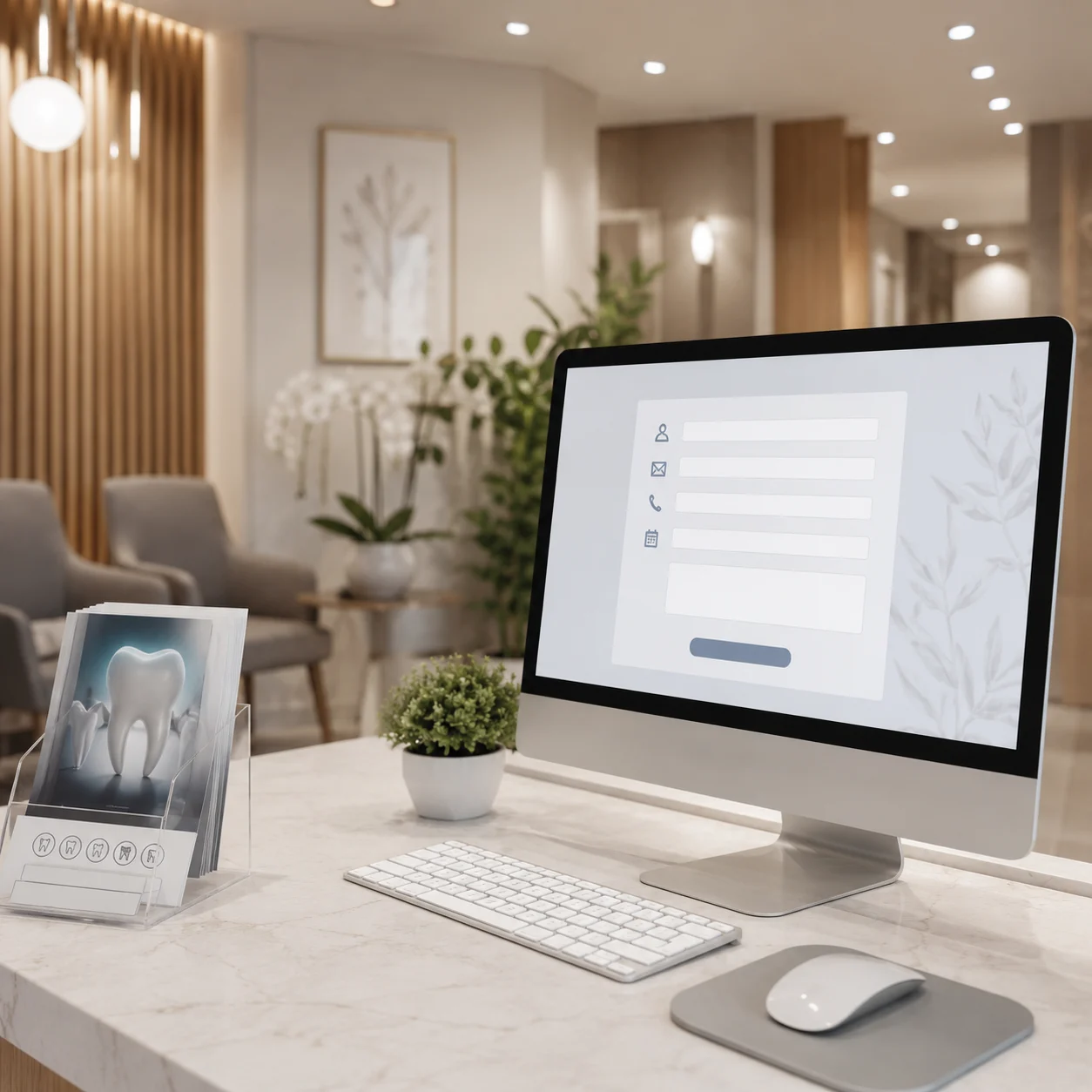
A contact form should feel like a quick first conversation, not a medical intake form. Patients shouldn't have to answer a dozen questions before they can reach your team.
Keep the form focused on the information your staff actually needs to respond:
• First and last name
• Phone number
• Email address
• Preferred contact method
• New or existing patient
• What can we help you with?
• Preferred appointment time, if useful
• Optional message
Use clear dropdowns such as “What can we help you with?” with options like a new patient exam, cleaning, tooth pain, cosmetic dentistry, implants, Invisalign, or an existing patient question.
Keep the tone friendly with a short reassurance such as, “Tell us what you need, and our team will help you with the next step.”
Avoid asking for detailed medical history or sensitive information on a basic contact form. That information belongs in a secure patient portal or intake form.
Your button should also tell patients what happens next. “Request My Appointment” is much clearer than “Submit.”
After submission, give patients a simple confirmation explaining that their request was received, when they can expect a response, and what to do if they need urgent care.
A useful way to evaluate your form is to understand the reasons dental website visitors don't convert, especially when visitors show interest but stop before completing an inquiry.
Patients who reach your contact page may already be interested in your practice, but they can still have doubts. They may be nervous about treatment, worried about cost, unsure about insurance, or simply wondering what will happen after they reach out.
Your contact page should answer those concerns before asking for their information.
Start with simple, genuine trust signals that help patients feel comfortable:
• Recent patient reviews that speak about real experiences and results
• Photos of your actual team and office instead of generic stock images
• Dentist credentials and experience that are easy to find
• New patient information, including whether referrals are required
• Accepted insurance and payment options
• Clear office hours and emergency instructions
• Expected response time so patients know when to hear back
• Privacy and security reassurance before they complete the form
• Accessibility and language support, when available
The placement matters too. Put your strongest trust signals close to the main CTA and contact form, where patients are most likely to pause and think twice.
Keep the messaging honest and specific. “New patients welcome." “Most major insurance plans accepted,” or “Our team typically responds during office hours” feels far more reassuring than broad claims like “We're the best dentist in town.”
Your contact page should do more than collect patient details. It should make patients feel confident that they’ve found a practice they can trust. Practices can also review how patient reviews influence SEO when deciding which trust signals to feature prominently.
Finding your practice should feel easy. Patients should not have to dig through your website to find the address, phone number, office hours, parking, or directions.
Give them the details they need in one clear place:
• Full practice name and address, including suite, floor, city, state, and ZIP code
• Phone number and office hours with holiday or after-hours information when relevant
• Parking details, including nearby garages, parking lots, or street parking
• Public transportation information if it helps patients reach your office
• Building access details such as entrances, elevators, or nearby landmarks
• Accessibility information, including accessible parking, entrances, and restrooms
• Simple directions from nearby highways, major roads, or well-known local landmarks
For multi-location practices, give each office its own address, phone number, hours, directions, booking link, and local information. A patient should never have to wonder which location they are contacting.
An embedded Google Map can also make the visit easier, especially when paired with a clear Get Directions button. Just make sure the map doesn't push your phone number or booking CTA too far down the page on mobile.
Most importantly, keep your practice details consistent across your website, Google Business Profile, Google Maps, directories, and social profiles. When everything matches, patients can find you more easily and feel confident they're contacting the right office.
Most patients will visit your contact page from their phone, often when they are ready to call or book. If the page is slow, difficult to use, or hard to read, they may simply move on.
A strong contact page should follow the principles of patient-friendly website design, making important information and actions easy to find across different devices.
Make sure your contact page includes:
• Tap-to-call phone numbers that work with one tap
• Easy-to-use booking buttons that remain visible on mobile
• Short, thumb-friendly forms with large fields, clear labels, and only the information you actually need.
• Readable text and strong contrast for easy viewing
• Fast-loading images and booking tools
• No horizontal scrolling or intrusive pop-ups
• Clear form errors and confirmation messages
• Accessible buttons, links, and images that work well with screen readers and keyboards
Test the page on an actual phone, not just a desktop preview. A contact page doesn't need fancy effects. It needs to load quickly, feel effortless, and help patients take the next step.
You should also pay close attention to page speed, since slow-loading contact pages can create friction at exactly the point when a patient is ready to contact the practice.
Patients should know what happens after they call, submit a form, or book online. A simple explanation can remove a lot of uncertainty.
Make the next step clear:
• Tell patients when they can expect a response.
• Explain whether their appointment is confirmed immediately or requires a call.
• Let them know what happens after they submit a request.
• Give clear instructions for urgent dental concerns.
For example: “Submit your request and our team will contact you during office hours to help schedule the right appointment.”
Privacy matters too, especially when patients are sharing contact information. Include a link to your privacy policy and a short privacy reassurance, and avoid asking patients to share detailed medical information through a basic contact form. Existing patients should be directed to your secure patient portal when they need to share sensitive information.
Finally, track what happens after someone contacts your practice. Form submissions alone don't tell you whether your contact page is working.
Track calls, form submissions, online bookings, booked appointments, and kept appointments. Connecting this data with your website and practice management system shows which contact methods actually bring in patients. Tracking these outcomes as part of your broader dental KPIs can help you understand whether your contact page is contributing to actual patient growth.
Our healthcare marketing expert will get in touch with you

.gif)