
There are plenty of reasons why a potential patient might leave your dental website just before booking an appointment. Maybe they cannot find your phone number, the booking form asks for too much information, the page takes forever to load, or they simply cannot find the answer they came looking for. Sometimes, the problem is even simpler: the website made booking feel harder than it needed to be.
Understanding where patients drop off can give your dental practice a much clearer picture of what is working and what is getting in the way. By looking at how visitors move through your website, where they stop, and what happens before they leave, you can find the small points of friction that quietly cost you appointments.
This article breaks down the most common patient drop-off points on dental websites and shows you how to find them, fix unnecessary friction, and turn more of those website visits into actual calls and appointments.
Patient drop-off is when a potential patient starts moving toward an appointment but leaves your dental website without completing that next step. It could mean visiting your services page, starting a contact form, clicking to book, or looking for your phone number, only to leave before taking action.
But leaving your website does not always mean you lost a patient. A visitor might find your phone number and call directly, check your office hours, get directions, or find the answer they needed before leaving. Technically, that counts as a website exit. In reality, it could still end with a booked appointment.
That is why a high exit or bounce rate alone does not tell you much. You need to compare what happens on your website with your phone calls, forms, and appointment bookings to understand whether patients are actually dropping off or simply taking the next step somewhere else.
The better question is not “How many people left my website?” It is “Where did potential patients stop moving toward an appointment, and why?”
Before you start digging through Google Analytics or staring at a maze of numbers, map out how a potential patient actually moves from finding your practice to booking treatment. This gives you a much clearer way to spot where patients are losing interest.
A typical dental patient journey might look like this:
Google search or ad → Website landing page → Treatment or service page → Reviews and trust signals → Call, form, or booking → Lead received → Appointment scheduled → Appointment confirmed → Appointment attended → Treatment plan presented → Treatment accepted
Every step has a different purpose, and patients can drop off at any point.
Website conversion is not the same as patient conversion.
This is an important distinction when looking for website drop-off:
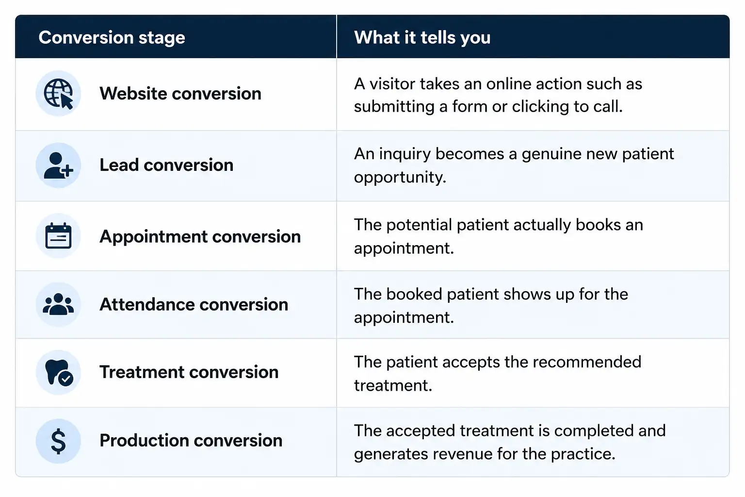
This matters because not every drop-off is a website problem. Your website might generate plenty of calls and forms, but if those leads are not followed up quickly, the problem could be happening after the patient leaves your site.
Avoid relying on one overall website conversion rate. Patients searching for emergency dentistry are behaving very differently from someone researching Invisalign or dental implants.
Look at important services separately. Compare your emergency, implants, Invisalign, cosmetic dentistry, and general new patient pages to see where visitors are taking action and where they are leaving.
A page that gets plenty of traffic but very few inquiries deserves a closer look. It could be missing clear calls to action, useful treatment information, strong trust signals, or an easy way to contact your practice.
You will find plenty of industry conversion benchmarks online, but they should be treated as a reference rather than a target. Your location, treatment mix, traffic sources, website quality, and patient intent all affect conversion rates.
The more useful question is whether your own numbers are improving. Track each stage over time, identify where the biggest drop happens, and then investigate what patients are seeing at that point.
That is how you move from simply knowing that patients are dropping off to understanding where and why it is happening.
Finding where patients leave your website is only half the job. The next step is understanding why they leave. A patient searching for an emergency dentist has very different needs from someone researching implants, Invisalign, or cosmetic dentistry.
Here are some of the most common reasons potential patients stop moving toward an appointment:
Your patients may find the information they need but still have no idea what to do next. The page explains the treatment, but the booking button is buried or the phone number is difficult to find. When booking feels like work, patients may simply leave and look for a practice that makes it easier.
How to identify: Check pages that receive plenty of traffic but generate few calls, form submissions, or booking clicks. Look at whether your primary call to action is visible without making visitors hunt for it.
How to fix: Give patients one clear next step on every important page. Use visible Book an Appointment, Call Us, or Request a Consultation buttons and repeat them naturally throughout longer service pages. You can also review these call-to-action optimization tips to identify ways to make important actions more noticeable.
Patients are not always filling out your form while sitting comfortably at home. They may be between meetings, on a lunch break, waiting in the car, or trying to book an appointment late at night. When a form is long, asks for unnecessary details, or feels like too much work, they may simply change their mind and leave.
How to identify: Compare the number of people who start your forms with the number who actually submit them. A large gap may indicate that patients are abandoning the form before completing it.
How to fix: Keep new patient forms short and ask only for information you genuinely need at that stage. Make sure the form is easy to complete on a phone, and give patients a simple option to call your office if they would rather speak with someone.
Your targeted patient rarely lands on your dental website with just one question. They may be wondering what the treatment involves, how much it could cost, whether it will hurt, if their insurance applies, or what they should expect at their first visit. If your website answers only the obvious question and leaves the rest hanging, they may leave and start looking for answers somewhere else.
How to identify: Listen to the questions your front desk hears repeatedly. Review your website search data, service pages, and common patient questions to see where important information is missing.
How to fix: Build those answers into your service pages and FAQs. Explain treatments in plain English and address practical concerns about cost, timing, discomfort, financing, insurance, and what patients can expect.
Choosing a dentist is a little more personal than choosing a product online. Patients are trusting you with their health, their money, and sometimes their very real fear of sitting in that dental chair. A website that simply lists treatments and says “we care about our patients” is not enough. Before they book, patients want to see the people behind the practice, hear from other patients, and feel confident that they are making the right choice.
How to identify: Look at your main landing pages from a new patient's perspective. Are reviews, dentist credentials, experience, office photos, treatment information, and patient experiences easy to find?
How to fix: Add genuine patient reviews, dentist profiles, credentials, office photos, and helpful information about what patients can expect. For treatments where appropriate, include real before-and-after examples with proper patient consent. For more guidance, see these dental website trust signals that can help reassure prospective patients.
A patient may be ready to call your practice, but your website makes the process frustrating on their phone. Text is difficult to read, buttons are too small, pages load slowly, or the booking form does not work properly. One bad mobile experience can be enough to make someone move on.
How to identify: Test your website on different phones, not just your desktop computer. Check page speed, menus, forms, booking links, click-to-call buttons, and how easily a patient can find your address and hours.
How to fix: Make mobile performance a priority. Compress large images, improve page speed, simplify navigation, make buttons easy to tap, and test every important patient action regularly. These mobile-friendly design tips can also help identify common usability issues on smaller screens.
Patients considering implants, Invisalign, veneers, or other major treatments often want some idea of cost before contacting a practice. If your website gives them no useful information at all, they may assume the treatment is outside their budget or simply keep searching.
How to identify: Review your higher-value treatment pages and ask whether they address the pricing questions patients actually have. Check whether your front desk receives frequent calls asking about treatment costs, financing, or insurance.
How to fix: Where appropriate, provide pricing ranges or explain what affects the final cost. Include financing information, insurance guidance, or details about consultations and treatment planning so patients know what to expect.
Sometimes the patient is ready to book. Your website just makes them work too hard to do it. They may have to click through several pages, create an account, wait for a booking system to load, or figure out which appointment type to choose.
How to identify: Go through the booking process yourself as if you were a first-time patient. Count the clicks, look for confusing instructions, and test the process on both desktop and mobile.
How to fix: Remove unnecessary steps wherever possible. Make appointment types easy to understand, keep booking buttons visible, and make sure patients can quickly see what happens after they submit a request. If broader website improvements are needed, review these dental website conversion rate optimization tips for additional ways to reduce friction.
A patient clicks an ad or Google result expecting information about Invisalign and lands on a generic homepage. Or they search for emergency dentistry and find a page that barely mentions emergency care. When the page does not deliver what the patient expected, leaving is the obvious next move.
How to identify: Compare your search queries, ads, and landing pages. Check whether patients are being sent to pages that directly address the treatment or service they searched for.
How to fix: Match each important landing page to the patient's search intent. If you advertise Invisalign, send visitors to a useful Invisalign page. If you target emergency dental searches, give those visitors an emergency dentistry page with clear information and an immediate way to contact your practice.
A website exit does not always mean a patient is lost. Sometimes, they found the information they needed and simply picked up the phone, checked your hours, or came back later to book. The real insight lies in what happened before they left. Look at the page they were on, what they were trying to find, and where they stopped moving forward. That bigger picture can reveal whether the friction sits on your website, in the booking process, or somewhere after the lead reaches your practice.

.svg)

Dr. Ruchir Mehra has spent nearly a decade at the crossroads of clinical insight and cutting-edge technology, reshaping how dental practices think, operate, and grow. He brings a rare fusion of medical precision and AI-driven innovation, helping practices and DSOs move from instinct to intelligence, and from scattered operations to scalable, compliance-first growth engines that perform.
Our healthcare marketing expert will get in touch with you


.gif)