
You only pay what you spend on your Google Ads, no commission or hidden charges
Most dental practices assume the problem is their marketing. The Google Ads are running. The clicks are coming in. The phone should be ringing.
But if your landing page isn't doing its job, every click becomes more expensive than it needs to be. Before increasing your advertising budget or blaming your campaigns, take a closer look at what happens after someone clicks your ad. That's where most practices quietly lose potential patients.
A well-targeted ad gets the right people through the door. A well-designed landing page gives them the confidence to book an appointment. You need both working together. Get one wrong, and the other struggles to deliver results.
In this guide, we'll walk through the most common landing page mistakes that quietly increase your cost per lead, lower your conversion rate, and send potential patients straight to a competitor. More importantly, we'll show you how to fix them, so every advertising dollar works harder for your practice.
Landing pages for dental paid advertising are built with one specific objective: turning a visitor into a booked patient. Every headline, image, form, and call to action should move someone one step closer to scheduling an appointment.
Here's what many dental practice owners don't realize: your landing page doesn't just affect how many people convert. It also affects how much you pay for every click before anyone even contacts your practice.
Google's Quality Score, which helps determine your ad rank and cost per click, directly considers your landing page experience. Following Google Ads best practices can help improve both your Quality Score and your campaign performance. If your page is slow, confusing, or doesn't match what your ad promised, your Quality Score can drop. That often leads to higher cost per click, higher cost per lead, and a lower return on your advertising budget.
For a practice spending $3,000 to $5,000 per month on Google Ads, even a small improvement in Quality Score can lead to meaningful monthly savings.
In simple terms, a poor landing page costs you twice. First, by increasing what you pay for every click. Second, by reducing the number of visitors who actually book an appointment.
As a team that's been involved in creating, optimizing, A/B testing, and scaling 800+ dental landing pages, we've seen the same mistakes appear time and time again across real dental advertising campaigns.
Here are the most common landing page mistakes that consistently drive up cost per lead, reduce conversion rates, and limit campaign performance.
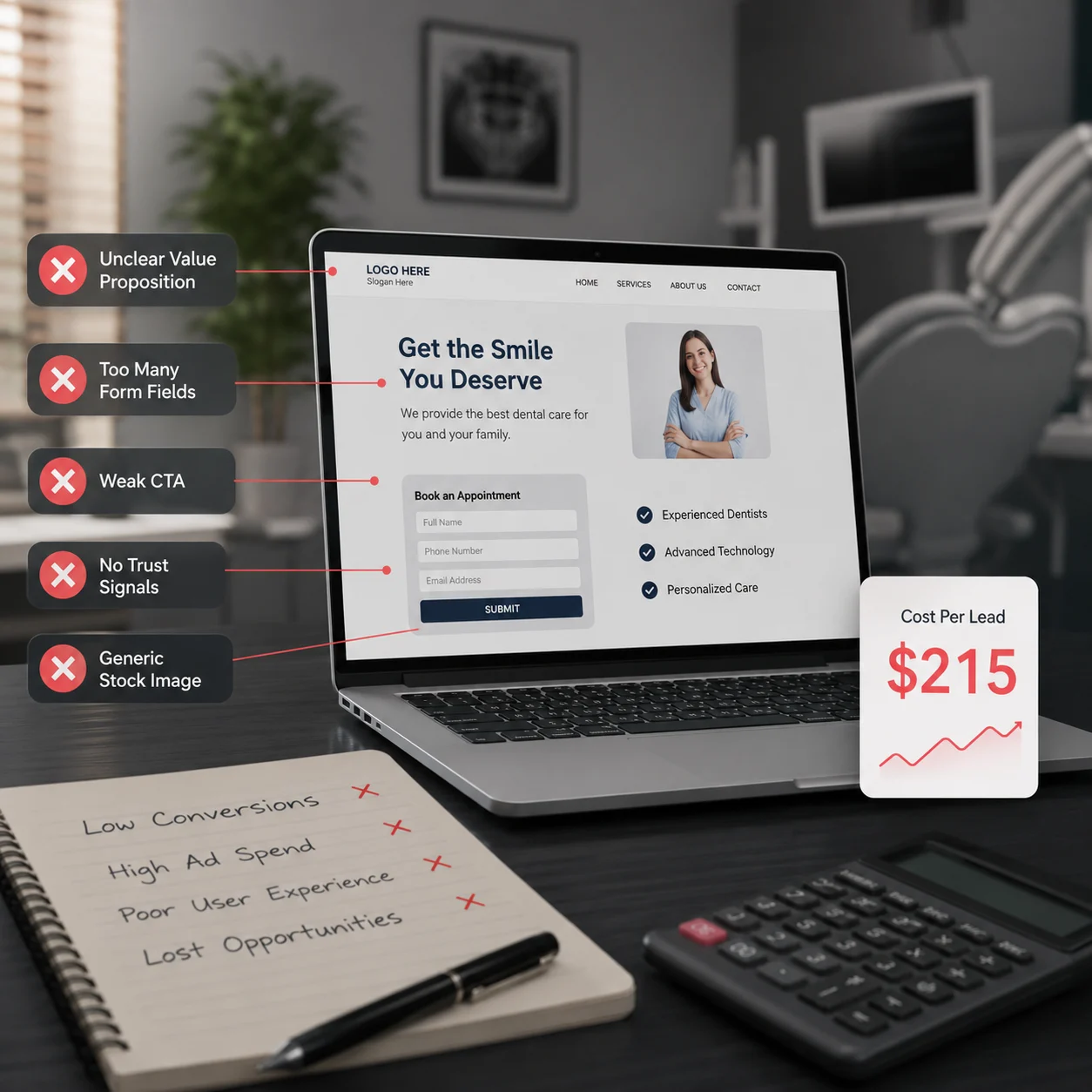
Imagine walking into a store where nobody tells you what they sell, why it's different, or why you should buy from them instead of the shop next door. You'd probably walk straight back out.
That's exactly what happens when your dental landing page has no clear value proposition.
When someone clicks your ad, they're looking for a quick reason to choose your practice. If your page opens with a generic headline like "Your Trusted Local Dentist" or "Comprehensive Dental Care for the Whole Family," it tells visitors what type of practice you are, but not why they should book with you.
Every visitor is silently asking the same question:
"Why should I choose this practice instead of the other dentists I was just comparing?"
If your landing page doesn't answer that within a few seconds, there's a good chance they'll leave.
How to fix it
This is, by a wide margin, the most expensive and most common mistake.
Your homepage is built to serve everyone: existing patients checking office hours, job applicants, insurance questions, and five different service lines at once. Someone who just clicked an ad for "emergency tooth extraction" doesn't want to navigate your homepage to find that information. They want it in front of them immediately.
The cost: Sending paid clicks to a homepage typically converts at 2% to 3%, compared to roughly 10% for a dedicated landing page built around that exact search. If you're paying $7.85 per click, a 2% conversion rate means you're paying close to $390 per lead. The same traffic sent to a matching landing page can bring that down to $80 to $100.
The fix: Build a separate landing page for every core service, including implants, Invisalign, emergency care, veneers, general checkups, and pediatric dentistry. Following proven strategies to increase landing page conversions helps ensure each page matches patient intent and converts more visitors. Each page should mirror the exact language used in the ad that sent the visitor there. This is called message match, and it's one of the cheapest, highest-impact fixes in all of dental marketing.
Some practices do create a dedicated landing page but then try to squeeze every service onto it, hoping to generate more inquiries from a single page.
Unfortunately, it usually does the opposite.
Someone who clicked an ad for dental implants doesn't want to scroll past teeth whitening, Invisalign, and children's dentistry just to find the information they came for. Every extra option slows the decision-making process, and in paid advertising, hesitation costs conversions.
Practices that build dedicated landing pages for individual services consistently convert better than those trying to make one page work for everything.
The fix: Keep it simple. One landing page, one service, and one clear call to action. If patients want to explore your other treatments, your website is the right place. Your landing page has one job: convert the specific search intent that brought the visitor there.
You have roughly three seconds before a visitor decides whether to stay or hit the back button. If your headline doesn't immediately answer "Am I in the right place?" and "Why should I choose this practice?", you've already lost them, and you've still paid for the click.
Vague headlines lipractice?" you'veactice Name]" or "Quality Dental Care You Can Trust" don't tell patients anything specific. They don't match the intent behind the search, and they don't give visitors a reason to keep reading.
The fix: Write a headline that is specific, relevant, and focused on the patient benefit.
For example:
Weak: Welcome to Bright Smile Dental
Strong: Same-Day Emergency Dental Care in [City]. Walk-ins welcome.
The second headline immediately tells visitors they've landed in the right place, highlights a clear benefit, and gives them confidence to take the next step.
Unique visuals play a big role in the success of a dental landing page, yet many practices still rely on generic stock photos that distract from the message instead of supporting it. Every image should reinforce the treatment or benefit being promoted.
If you're advertising dental implants, patients should see implant-related visuals, your practice, your team, or genuine before- and after- results. Showing unrelated stock images or generic smiling models makes the page feel less authentic and can reduce trust.
Patients often judge a landing page before they read a single word. Relevant, high-quality visuals reassure them they've found the right practice and encourage them to keep exploring instead of leaving.
The fix: Use real photos of your practice, dentists, team, and treatment results wherever possible. Make sure every visual supports the service being advertised and strengthens your overall message rather than filling space.
Every extra field on your contact form gives a potential patient one more reason to leave without booking. This isn't just a theory. It's one of the most consistent findings in conversion optimization.
Many dental landing pages ask for far too much information before a patient can even request a callback. Insurance provider, preferred appointment time, reason for the visit, referral source, date of birth, and a detailed message can all feel overwhelming, especially for someone who simply wants to speak to your practice.
Patients looking for an appointment don't want to complete paperwork before they've even made contact. They want a quick, simple way to reach you.
The fix: Ask only for the information you need to make first contact, usually the patient's name, phone number, and, if helpful, the treatment they're interested in. You can collect everything else during the phone call or at their first appointment. In most cases, the fewer fields your form has, the more enquiries it will generate, helping lower your cost per lead.
Patients don't book appointments because of great design alone. They book because they trust the practice behind it. Building strong patient trust is one of the biggest factors influencing whether visitors become booked appointments.
If someone has never visinquiries practice before, they're looking for reassurance within the first few seconds. If the top of your landing page doesn't give them a reason to trust you, many will leave and compare another dentist instead.
One of the biggest mistakes dental practices make is placing their reviews, awards, credentials, or patient testimonials too far down the page. By the time a visitor reaches them, they may have already clicked away.
Trust signals don't have to be complicated. Even a strong Google rating, recognised dental association logo, accepteda recognized badges, years of experience, or a short patient testimonial near the top of the page can make a meaningful difference.
The fix: Place at least one strong trust signal near the top of the page. This could be a Google rating such as 4.9 stars from 350+ patients, accepted insurance logos, professional association badges, years of experience, or a short credibility statement. Save detailed patient testimonials, before and after photos, and case studies for further down the page, once you've convinced visitors to keep reading.
Along with treatment information, patients also want clarity about cost. One of tbefore-ckest ways to lose potential patients is to make them guess whether you accept their insurance, whether the consultation is free, or what they can expect to pay.
Most people don't want surprises when it comes to dental treatment costs. If they can't find even basic pricing or insurance information, many will leave your landing page and continue comparing other practices. Others may book an appointment only to discover the treatment is outside their budget, creating an enquiry that was never likely to become a patient.
The fix: You don't need to publish a full price list, but you should provide enough information to set clear expectations. Mention whether consultations are finquiryst the major insurance plans you accept (or simply state "We accept most major PPO plans"), and where appropriate, include a starting price or price range for the treatment. Clear pricing and insurance information build trust, attract more qualified patients, and help lower your overall cost per lead.
Most dental ad traffic comes from mobile phones, often from someone in pain, searching on the go. If your landing page takes more than a couple of seconds to load, or if the layout breaks on a phone screen, with tiny text, buttons that are hard to tap, or forms that don't resize properly, you lose visitors before they ever see your offer.
Slow, non-mobile-friendly pages also hurt your Quality Score, which, as covered earlier, raises your cost per click on top of reducing your conversion rate. Applying mobile-friendly website tips can significantly improve both user experience and conversion rates. It's a double penalty.
Most visitors give up on a slow-loading page within about three seconds, and once they leave, only around 1 in 5 will ever give the site a second chance. That single missed first impression can mean losing a lead permanently, not just delaying it. It also carries a longer-term cost specific to healthcare. A poor mobile experience doesn't just hurt today's conversion; it makes a visitor less likely to trust the practice enough to return for future care or leave the kind of review your local SEO depends on.
The fix: Test your landing page on an actual phone, not just a desktop browser resized smaller. Compress images, remove unnecessary scripts and pop-ups, and make sure your call-to-action button and phone number are large enough to tap accurately with a thumb.
Too many dental landing pages end with a generic call to action that tells patients what to do, but not why they should do it.
Buttons like "Submit," "Contact Us," or "Book Now" aren't necessarily wrong, but they don't give patients a compelling reason to take the next step. After reading your page, visitors should immediately understand what they'll gain by clicking, not just what action they're expected to take.
A strong call to action doesn't simply ask for a click. It communicates value. Whether that's scheduling an appointment, speaking with your team, checking availability, or getting answers to their questions, patients should feel they're receiving something worthwhile in return.
The fix: Make your call to action benefit-driven instead of action-driven. Place one clear CTA above the fold and repeat it naturally throughout the page. Most importantly, make it obvious what patients will receive after clicking, because people respond to value far more than instructions.
This isn't technically a landing page design mistake, but it's the one that makes every other mistake on this list almost impossible to identify. If you're not tracking which landing page, ad, or keyword generated each phone call and form submission, you have no way of knowing where your cost per lead is actually increasing. You're simply guessing, or relying on someone else to tell you everything is working.
Many dental practices still don't track their marketing in a meaningful way. As a result, they continue spending money without knowing which campaigns are generating real patients and which are wasting budget. Regularly reviewing SEO and marketing ROI alongside paid advertising metrics helps identify what's actually driving patient growth.
The fix: At a minimum, set up a dedicatguessing orking number for each landing page, connect form submissions to a CRM or reporting spreadsheet you review regularly, and track three key metrics every month: cost per lead, cost per booked appointment, and cost per patient who actually shows up. That final number is the one that tells you whether your marketing is truly delivering results.
A landing page built once and left untouched for years will always underperform one that's tested and refined. Small changes, such as a different headline, a shorter form, a repositioned phone number, or a new CTA button colour, can meaningfully improve conversion rates. Over time, those improvements compound and help lower your ccolor, lead.
The fix: You don't need constant, complicated A/B testing to benefit from this. Even a quarterly review, checking your conversion rate, updating an outdated headline, refreshing old photos, or shortening the form, helps keep your landing page performing as hard as your advertising budget deserves.
Get in touch with our healthcare marketing expert