Call :
+16505578269Email :
support@remedo.io
You only pay what you spend on your Google Ads, no commission or hidden charges
A dental website can quietly shape a patient’s decision long before they ever call the practice. If your website is attracting visitors but not converting them into inquiries, the issue may not be your services, pricing, or marketing spend. It may be how your practice makes people feel the moment they land on the page.
The most effective dental websites do more than look modern. Through emotive website design, practices can create trust, reduce hesitation, and help patients feel understood before they ever walk through the door. From calming visuals and patient-centered messaging to stronger user journeys and reassurance at every touchpoint, design has the power to influence whether someone keeps browsing or books an appointment.
Below, explore how emotive website design helps dental practices create stronger first impressions, build confidence, and convert more visitors into patients.
Before going any further, let’s clear something up. Emotive website design is not about making your website look prettier. And it is definitely not about dropping in a stock photo of a smiling family and hoping for the best.
Emotive design is a deliberate approach that uses visuals, messaging, layout, color, and user experience to shape how patients feel while interacting with your website. It is also an important part of a broader dental website services that focuses on patient trust and conversions rather than aesthetics alone.
Think about the difference between walking into a dental practice that feels calm, welcoming, and reassuring versus one that feels cold, clinical, and overwhelming. You notice it instantly. Your website creates that same first impression except it happens in a matter of seconds, long before a patient ever walks through your doors.
The strongest dental websites are designed to create emotional confidence at every touchpoint and help patients feel
Safe — “I feel comfortable trusting this practice.”
Understood — “They understand what patients like me worry about.”
Confident — “These people clearly know what they are doing.”
Welcome — “This feels like a place I would actually visit.”
Ready to act —"Booking an appointment feels like the right next step.”
When a website creates these emotional signals naturally, patients stop feeling like they are being sold to and start feeling ready to choose.
Dental care today has evolved far beyond clinical outcomes alone, and patient expectations have evolved with it. Patients are not only evaluating your experience, technology, or treatment options. They are also paying attention to how your practice feels from the very first interaction.
And for most people, that first interaction happens on your website.
A dental website’s appearance, professionalism, and usability shape patient trust within seconds of landing on the page. Before reading about your services or checking your credentials, patients are already forming opinions: Does this practice feel credible? Will I feel comfortable here? Is this somewhere I would trust with my care?
That is why even outstanding dental practices can quietly lose patients online.
Not because the dentistry is poor. Not because pricing is wrong. But the digital experience never creates enough confidence, connection, or reassurance to move someone from interest to action.
Most underperforming dental websites tend to struggle with one or more of these:
Generic visuals that feel staged
Perfect smiles and polished stock photography may look professional, but patients connect with authenticity. Real people, real moments, and real practice experiences build trust faster.
Clinical language that explains everything and says nothing
Patients are not searching for “comprehensive oral healthcare solutions." They want to know whether you are gentle, experienced, and able to help with their specific concern.
Trust signals are hidden instead of highlighted.
Reviews, patient stories, credentials, financing options, and before-and-after outcomes often appear too late in the journey after visitors have already decided to leave.
Confusing navigation
If visitors cannot quickly figure out how to book an appointment and have to click through multiple pages to take the next step, many will leave before ever contacting your practice.
No emotional progression through the experience
Strong websites guide people from uncertainty to reassurance. Weak websites read like service menus and leave patients feeling exactly as they arrived.
Slow performance that creates an instant drop-off
Patients expect speed. If pages hesitate, users disappear, and attention goes with them.
Not mobile-optimized
Most visitors are discovering practices from their phones between meetings, during lunch breaks, or late at night. If your website feels difficult on mobile, they rarely give it a second chance. Following proven mobile user experience best practices can help practices reduce friction and improve engagement across all devices.
Here is something most dental training never talks about: patients rarely make decisions based on logic alone. More often, people feel first and justify second.
And this is not just marketing theory. It is backed by neuroscience.
Research led by neuroscientist Antonio Damasio found that people with damage to the emotional centers of the brain struggled to make even simple decisions despite retaining normal reasoning ability. Emotion is not separate from decision-making. It is part of how decisions happen.
That matters more than most dental practices realize.
When someone lands on your website, they are not immediately comparing treatment specifications or reading every word. Their brain is making fast, emotional evaluations:
- Does this place feel trustworthy?
- Will I feel comfortable here?
- Does this practice understand patients like me?
- Do other people seem to have had a good experience?
- Do I feel confident taking the next step?
Your website is already answering those questions, whether you intended it to or not.
The colors you choose influence emotional perception. The imagery you use shapes familiarity and trust. Clean layouts create a sense of professionalism. Real patient stories reduce uncertainty. Clear calls to action make decisions feel easier.
Every design decision creates an emotional response.
Let's get practical. Here are the specific design elements that move the needle for dental practices in the United States.
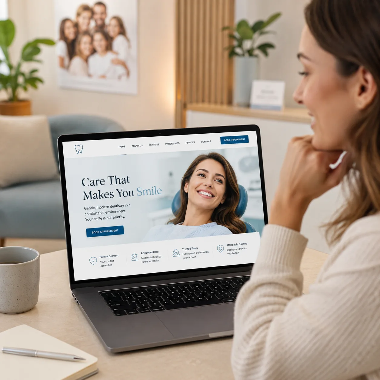
The “hero” section is the first thing a visitor sees when they land on your homepage, usually a large image or video paired with a headline. This is the most important space on your homepage.
Yet most dental practices underuse it completely by leading with lines like "Welcome to [Practice Name], Your Trusted Family Dentist in [City].”
It sounds polite, but it does very little in practice. It does not evoke emotion, and it does not answer the silent questions every patient is already asking the moment they arrive.
An emotive hero section takes a very different approach. It leads with the outcome, not the service.
Compare these two headlines:
"Comprehensive Dental Care in Austin, TX"
"Feel Comfortable. Smile Confidently. Dentistry Designed Around You."
The second version directly acknowledges fear (dental anxiety), removes emotional hesitation (fear of judgment), and presents a clear desired outcome (confidence). In just a few words, it activates multiple emotional triggers at once.
Best practice: Use real imagery of your actual team rather than stock photography. Authentic faces create immediate trust. A genuine smile from your dentist or hygienist often does more to convert a visitor than any headline ever could.
This deserves its own section because the impact is bigger than most practices realize.
Stock photography is one of the biggest killers of emotional connection on dental websites. Patients know when a photo is fake. The lighting is too perfect, the smiles are too white, and no real human has ever held a toothbrush at that angle.
What works instead:
- Real photos of your practice, including the reception area, treatment rooms, and patient spaces
- Genuine team photography showing your staff naturally interacting and smiling
- Before and after transformations featuring actual patients with proper consent
- Short videos that give patients a feel for your office environment
- A simple “Meet Your Dentist” video where you speak directly to patients, because even 30 seconds of authentic conversation often builds more trust than a long written biography
Practices that invest in professional dental photography consistently report higher engagement, longer time-on-site, and more appointment requests. It's one of the highest-ROI investments a dental practice can make in its marketing. This impact is often even greater when paired with custom-built dental websites designed around the unique needs of the practice and its patients.
Trust signals are the proof points that tell a patient, "Other people have been here, it went well, and you'll be fine too."
One of the biggest mistakes dental websites make is treating trust as a separate page. Reviews, credentials, and proof points get pushed into a “Testimonials” section that very few visitors ever open.
The strongest dental websites do the opposite. They place trust signals throughout the patient journey exactly where hesitation is most likely to happen.
Some of the most effective trust builders include:
- Your Google rating is displayed clearly in the header or hero section instead of being hidden further down the page.
- Genuine patient testimonials with names and photos, where appropriate, because anonymous reviews feel less believable
- Recognition from local media, dental organizations, or healthcare publications
- Professional memberships and affiliations, such as the ADA, state dental associations, or specialty organizations
- Years of experience and the number of patients treated because specifics create confidence
- Before and after galleries that help patients visualize outcomes
- Video testimonials where patients speak naturally because authentic experiences build trust faster than polished copy
Pro tip: Place a short testimonial directly above your "Book an Appointment" button. That's the exact moment a patient needs final reassurance before committing. Give it to them there.
Read your website copy out loud. Does it sound like something you'd actually say to a patient in your waiting room? Or does it sound like it was written by a committee trying to impress nobody in particular?
Clinical, formal, jargon-heavy language creates emotional distance. And emotional distance kills conversions.
Replace this kind of language:
"Our practice utilizes state-of-the-art diagnostic equipment and evidence-based clinical protocols to deliver comprehensive oral health outcomes."
With language that sounds like a real person:
"We use the latest technology to find problems early, which means less treatment, less cost, and a lot less time in the chair."
Same information. Completely different emotional impact.
Specific language techniques that work for dental websites:
- Use "you" more than "we": patients want to know what's in it for them.
- Acknowledge dental anxiety directly: something like, "We know visiting the dentist can feel stressful. That's exactly why we've built our practice around comfort first." This one line can dramatically increase trust among anxious patients.
- Name the outcome, not the procedure: patients don't want "porcelain veneers"; they want to "love what they see in the mirror every morning."
- Use conversational contractions: "we're," "you'll," and ""it's"—formal language creates walls; contractions tear them down.
What happens after a patient decides to book matters just as much as what convinced them to stay.
Once someone feels comfortable with your practice and ready to take action, the booking experience should feel simple, clear, and effortless. The easier you make that next step, the more likely patients are to follow through.
The booking path should be:
- Visible without scrolling: a "Book an Appointment" button in your header, always
- Available in multiple forms: online booking widget, phone number, text-to-book option
- Clear about what happens next: "Book in 60 seconds. We'll confirm by text" removes uncertainty.
- Low-commitment language: "Request a Free Consultation" or "Book Your New Patient Exam" feels easier than "Schedule an Appointment."
Try to keep the path from landing on your website to completing a booking request to no more than two clicks. Every additional step creates friction and increases the chance of losing a patient.
Mobile booking matters more than ever. Today, most dental appointment journeys begin on a smartphone. If your booking process feels difficult on mobile, patients may leave before they ever have the chance to visit your practice. Creating a seamless responsive website experience is essential for keeping those prospective patients engaged.
Here's where design meets technical reality. The most emotionally compelling dental website in the world is useless if it takes eight seconds to load.
Google uses page speed as a direct ranking factor. More importantly, real patients leave slow sites. Every additional second of load time reduces your conversion rate by approximately 7%.
Practical steps to improve dental website speed:
- Compress all images before uploading (tools like TinyPNG make this simple)
- Use a reliable web hosting provider — not the cheapest shared hosting available
- Eliminate unnecessary plugins if your site runs on WordPress.
- Enable caching so returning visitors get a faster experience
- Ensure your site passes Google's Core Web Vitals—your web developer can check this in Google Search Console.
Many of these issues are among the common healthcare website pitfalls that negatively affect both user experience and conversion rates.
Aim for a load time under 2.5 seconds on mobile. That's the threshold where Google considers your site "fast" and where patients are most likely to stay.
Emotive design helps patients stay, connect, and convert. Local SEO is what helps them find your website in the first place.
When people need dental care, they rarely search for a practice by name. They search based on location and intent:
- “dentist near me”
- “family dentist in [city]”
- “emergency dentist [zip code]”
- “affordable dental care in [city]”
- “cosmetic dentist near me”
- “dental implants [city]”
- “teeth whitening near me”
Your website should be built to show up for these searches in the locations you actually serve.
Design and content choices that strengthen local visibility include:
- Dedicated location pages for each city or neighborhood you serve so patients can find the most relevant information.
- Consistent business details with your full Name, Address, and Phone Number visible across your website.
- Schema markup that helps search engines understand who you are, what services you provide, and where you operate.
- Google Business Profile alignment so your website and local listings send the same trust signals.
- Locally relevant content, including service pages, FAQs, and educational content that naturally reflects your market.
The practices that consistently earn top local positions are not always the biggest or most established. More often, they are the ones combining strong local SEO foundations with a website experience that makes patients want to stay and book.
If your website struggles to build trust, generate inquiries, or reflect the quality of care you provide, it may be worth evaluating the warning signs your website needs an update. Small improvements in design and user experience can often lead to meaningful increases in patient conversions.
Get in touch with our healthcare marketing expert